Gaj.st is primarily my online CV and professional portfolio. It began as a blog-first project, and I’m gradually returning to that direction by publishing more articles alongside my work.
My goal is to create new connections, and maintain a space where I can occasionally share ideas, experiences, and reflections on technology, design, and the broader topics that inspire me.
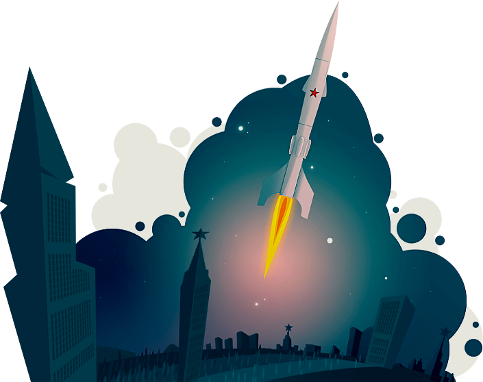
Kosmos is the eleventh iteration of this project’s design. The original version was inspired by a rocket illustration I created.
Design
With all my work, I prioritize simplicity. That is especially true for my personal CV. Kosmos was always a lightweight theme, no matter whether it was powered by my own PHP framework, a JavaScript static site generator, or a modern framework like Astro or SvelteKit.
I always imagine a cream background with slightly faded typography. I prefer big serif letters for titles and smaller sans-serif, or more recently monospace for content. Articles are the exception. I truly dislike when I try to read a long post online and the typography is miniature. For articles like this one, therefore, I stick to larger serif fonts and generous letter sizing.
This particular design was inspired by the work Christine Røde did for @diabrowser. I saw it, and it clicked right away.
I was already moving in this direction myself. My radio project uses pixel fonts. One iteration of the editor project I’m working on also had pixel fonts and a retro design inspired by some of the old ncurses applications. However, printed feel, 1-bit aesthetic, was an intriguing retro look from an era long gone, and a practical design challenge.
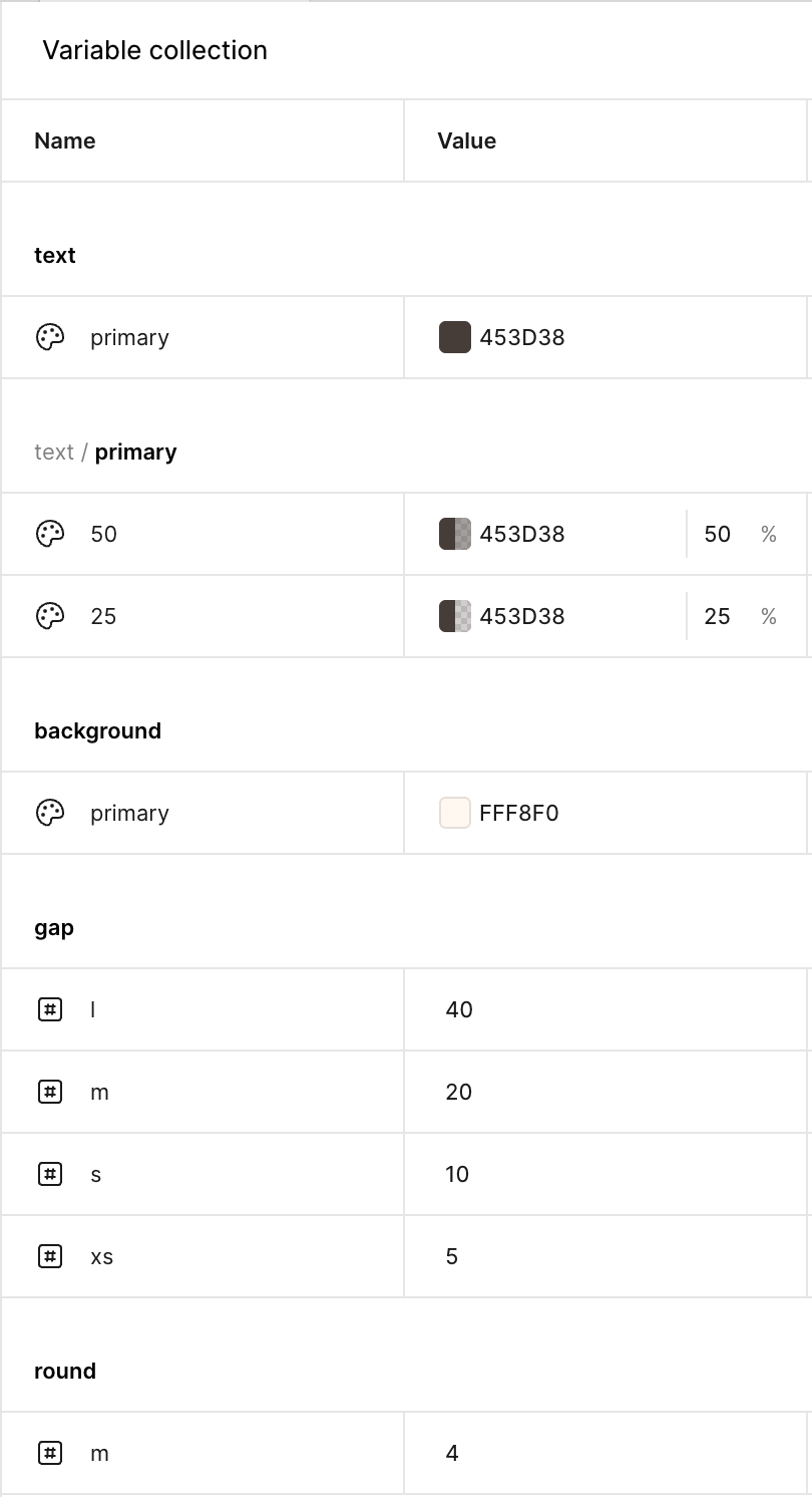
I put everything else aside and started designing. The first evening on Figma. A light draft first, then components, variables, and styles. Four colors. Only two unique really, the remaining two were simply 50% and 25% transparency variants of the first. The fact that the final library consisted of just a handful of styles and variables made me feel I was on the right track.
The big chunks of the layout and most of the actual copy came from the existing version. I reorganized things a little but mostly left them intact. It all looked fine in Figma, but... well, I should say a word or two about challanges in the following section.
Finally, theming. Color variations. I tried them in Figma first, just as a sneak peek, and they felt right. I didn’t try to push them too far, just subtle variations of the background and typography colors. During the actual implementation, the themes became more varied. Feel free to check out the theme selector at the top.
Architecture
After the design was done, I moved on to coding the project. The agent took care of the boring parts, like the initial setup and boilerplate. I took the rest.
With projects like this, I like to hand-code. It’s not a large project, and I want to keep the complexity down. I want the feeling of it being handcrafted, not just in terms of design, but the code as well.
On the previous version, the tech stack was Astro with Svelte components. I love Astro. I think it’s a great framework. But once more interactivity was needed, introducing a secondary framework just felt a bit off. The complexity grew, and the codebase somehow became poorly maintained, or at least that was my feeling.
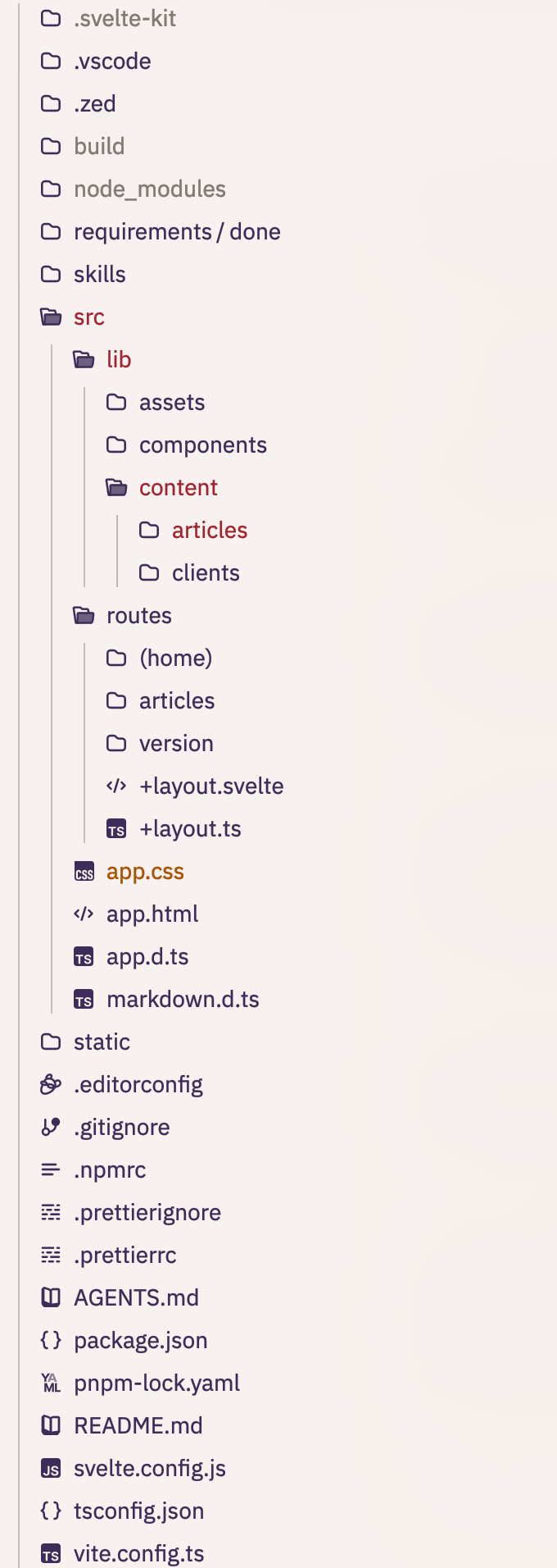
With this upgrade, therefore, I decided to go with SvelteKit. I used mdsvex to parse the Markdown content. Markdown isn’t driving everything, though. In many cases, plain HTML is simply a better fit than forcing a mixture of HTML and Markdown syntax into a single file.
I didn’t add any other libraries besides Fontsource for fonts. Not even Tailwind. I use it on other projects, and I do think it’s a good way to approach styling. But it has its downsides. For this project, `style` tags inside Svelte components, together with a few utility classes, did the job perfectly well.
From here on, it was smooth sailing, and the page came together relatively quickly.
Challanges
As I had the project fully coded, it became clear the homepage layout really didn’t work. It was too noisy. Too much text, too many columns, too many bullet points. Some layout adjustments were needed, but the main task was updating the copy. The amount of text had to be reduced. In the Clients section, I hid the longer descriptions and revealed them on click. The Skills section needed a bigger restructuring, moving away from a grid layout toward a more descriptive format. I’m still not completely happy with it, but it’s mostly there.
The 1-bit color scheme presented two rather different challenges. The first was how to introduce enough visual variety when colors are almost absent. Typography and patterns became the main answer to that one.
The second challenge was more mundane: what to do with images - my profile photo and those included in blog posts. Fully colorful images simply wouldn’t fit the rest of the design language.
This was a question I needed an answer to before I even finished laying out the design in Figma. One option was to generate PNGs with a limited color palette (1-bit, two colors), but the results were not particularly appealing. So I started looking online for proper palette reduction tools. Something with dithering would be ideal.
1-bit Pixel Art Tool proved really helpful in this process. Once I landed on the right settings, I created an AI skill to assist with the otherwise mundane task of converting images:
The command reads every `.jpg` file in `static/articles/<article-id>/` and writes `lowres-<source-stem>.png` beside the originals. It uses the exact 16-colour PICO-8 palette, Jarvis–Judice–Ninke diffusion at `0.70`, dither scale `1.0`, and resizes images down to a maximum height of 600px.That, however, wasn’t the final result. With CSS, the images are blended using mix-blend-mode: luminosity together with the primary text color. The original full-color image is then overlaid and revealed on hover, or displayed in full when opened.
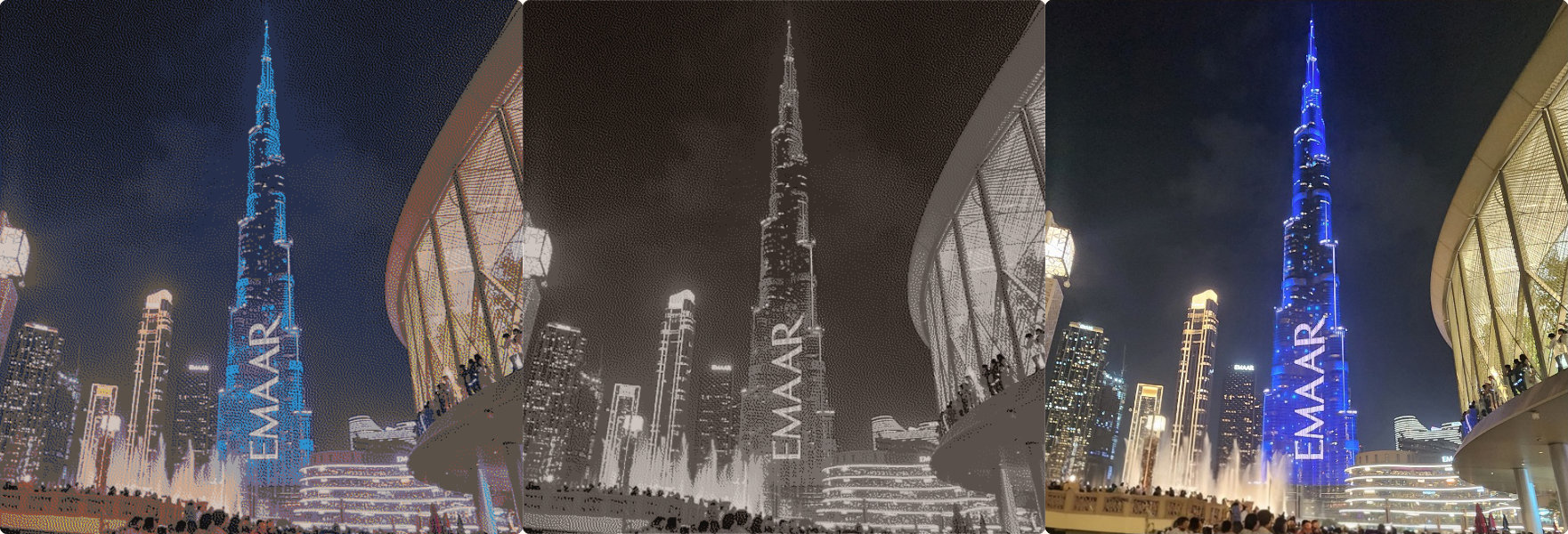
The results are still somewhat varied. Some image and theme combinations look rather striking, while others feel a little out of place. There’s still work to be done on this front.
Future
The image processing pipeline still needs some work to produce more interesting results. I already have a few ideas on how I’d like to approach it.
The homepage layout could also use another iteration, especially the Skills section.
While the mobile experience is already in a decent place, it could still benefit from some additional attention and refinement.
There’s also an idea to automatically switch between dark and light themes based on the browser’s preferred color scheme.
Finally, the Art section is still missing from the previous version. I’d like to bring back a selection of my digital paintings from years ago. The Bookshelf section is also waiting to return. It listed the books I’ve read and turned out to be a surprisingly useful reference for myself over the years.